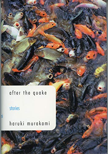
The first time I read after the quake, a collection of short stories chronicling various experiences in the wake of an earthquake, I checked out a library copy with an amazing cover of koi fish in a frenzy (left), mouths agape with terror and drawing you in to learn what they're so upset about. It's a beautiful photo objectively, and I love how it takes over the whole cover. The unsettling of nature naturally lends insight to why things affect humans so profoundly - rational beings that are nonetheless shaken to the core by natural disasters, despite placid outward appearances.
When I went to the bookstore to try and buy a copy, however, I was faced with something else - a generic, oversaturated abstract image of a puddle with lazy contemporary design and all caps lends hardly any semblance to either the stories within or Murakami's explicitly stated intention that the translation should be displayed in all lowercase.


As much as I love Murakami, his writing can hardly be described as colorful. And yet, every one of his works now is being published with the same obnoxiously bright and ugly design convention. The above cover is actually one of the least offending ones. I own a copy of his short story collection Men Without Women, in spite of its horrible design. I would absolutely never pick it up unless I was specifically looking for it or it was on sale (both of which applied to why I bought it).

Although I thoroughly enjoyed the stories within, and the healing they afforded me in the midst of a horrible breakup, the cover was and is a constant affront to the beauty of what it contains. To turn Murakami's delicate, meditative prose into an ugly gradient and generic stock image of a woman's face is something almost unspeakable. I think I've either written to (or strongly considered writing to) the publisher, Vintage, about my displeasure. Below are three alternative designs, all of which lend a delicate poeticism that my own copy lacks. There is a difference between simplicity and laziness. It's about nuance.


I've also always been partial to 60s/70s design and what it inspires, because I think the simplicity of it is mostly unrivaled by today's flashiness. Intentionality. Below are some that come to mind.


Covers are obviously very important to me, and I think they have the potential to do a lot for your experience of a book. The same can be said for the opposite. I enjoyed the video we watched in class on Friday because, as overly theatrical as Chip Kidd was, he gets it. He lends immaculate consideration to every book's contents to extract a cover that will perfectly do it justice. It is not a formula. It's an art.
No comments:
Post a Comment